

 |
FFvii Fortress v14 (local)
›› Posted On: 07.27.13 at 3:49 am ~ Tags: 2006, Layouts, RPGs
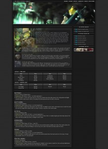
FFvii Fortress is my baby, it’s the RPG that I’m most associated with and that I’ve spent the most time actually working on and running. The original Fortress opened back in 2003, though this layout is from the final release which was circa 2006 or so. Over a span of three years most of my RPG time and attention when to Fortress and through the evolution of the site it shows. The original Fortress was plain, the content pretty bad those the systems were in place early on. After a couple successive re-makes I finally found myself with the talent I needed to do it right, to make it look and ‘feel’ the way I wanted it to from the start and it shows in pages like this one. I selected the location template as the page to show, while not perfect (honestly I should have done a little more designing in the quest area but you have to remember MSN Groups was limited to 16kb page size so I couldn’t do much more). The layout itself is pretty standard for me at the time, clean, not flashy in any way. However, what always stood out with Fortress is the time I spent working on the in-page content design, as detailed here with the actual location image and sub-location information. I’m still really proud of these pages and hopefully some day soon I can have the whole site archived here (as well as the previous version so you can see the evolution for v2 to v3)
|
 |
Ultramodern
›› Posted On: 12.15.12 at 6:04 pm ~ Tags: 2005, Abstract, Artwork, Wallpapers
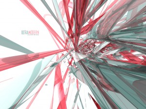
Ultramodern is sort of alone in a sense, at least how it relates to the other work in my portfolio. When I created this wallpaper I was really experimenting with a lot of different styles and a lot of different programs, Ultramodern is the result of one of those experimentation session. This wallpaper was created in Bryce 5, a lesser known and less powerful 3D modeling software. The reason I liked Bryce is because it had some really nice textures and tools to apply said textures. This is basically a bunch of oval rings with glass like textures bunched and then a zoom out in perspective. The result was something that reminding me of the tubes you see in sci-fi movies, so that’s where the name comes from.
|
 |
Arachnid Designs ~ Ver.3
›› Posted On: 12.15.12 at 5:53 pm ~ Tags: 2004, GFX Sites, Layouts
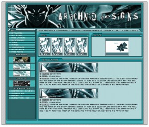
This layout was a special one, a very special one. Up until this point, most of my layouts had been pretty bad (not that this one isn’t by today’s standards) but when I made this layout and uploaded it to DeviantART I found it got a lot of attention (at least for me, lol) which was a big surprise. Again up until now I hadn’t really done any wallpapers or much in the way of actual art, none of us were very good, this was the beginning of everything to come. The first challenge after making it, was to code it on MSN Groups. That was not easy in 2004, I was better than most everyone else on Groups at HTML but I still sucked and it was a real challenge making this look like it did in my design, but I pulled it off. Sad to say that AD was pretty much going downhill by that point, the split had already happened and the site didn’t last that much longer. Still, this was an important layout, it will always hold a special place for me.
|
 |
CPN Groups Layout
›› Posted On: 12.12.12 at 2:12 am ~ Tags: 2009, CPN, Layouts
CPN and by connection of course CPN Groups was a big stepping stone for me. Finding out that MSN Groups was going to be closing was a major blow, by that time I had spent 8 years or so RPing and building my RPGs and communities on MSN Groups. With that news there was only one option, make my own. I really was out of my league when all of this started but somehow in the end I made it all work. The idea being that CPN Groups would be just like MSN Groups in structure but with more modern features, that meant that the actual group design would be similar to what MSN Groups had looked like, but with my own flair. Looking at this screenshot you can see how close the structure was to MSN Groups but it brought in the CPN theme and worked out really well for us while it lasted. I have some different color themes (black and pink) that were going to be released a long with an assort of others as premium themes, I’ll post some screens of them in the comments section.
|
 |
Memoria Chains v2 Homepage
›› Posted On: 12.10.12 at 1:05 am ~ Tags: 2006, Layouts, RPGs
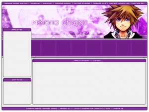
This was kind of an interesting layout for me, for one it was for a friends website but I really put a lot of effort into making in something different for MSN Groups. At the time the idea of having a navigation and content areas not be even was something you didn’t see on MSN Groups because of the limited HTML allowed so when we showed this one off it was a big hit. In the end the RPG never actually got finished, which is a let down but I was really happy to do the layout for Serno and it’s one that I always enjoyed, I wish I still had a coded version of it someplace so it could be seen with content, but alas I only have the original working image that was used to slice from. As a side note many of the ideas here ended up making their way to my own Kingdom Hearts RPG that I started work on when Serno stopped working on Memoria Chains. This layout was made entirely in Adobe Photoshop 7.
|
 |
DBZ: Renewed Faith Ver.2
›› Posted On: 11.20.12 at 8:06 pm ~ Tags: 2006, DBZ RPGs, Dotcoms, Layouts
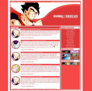
Dragon Ball Z: Renewed Faith had a very long and interesting history, especially early on. Originally the RPG was being developed exclusively by Saiyen who one day in the Create chatroom took part in a lengthy discussion about how a true DBZ should be made, which led myself to becoming co-designer of the RPG. We really hyped RF up a lot, and we gained a lot of attention, some of it not so good. The original design, which is much like this one, was based off a Trigun Project Seeds layout I never used, just with the banner swapped out. However this bad attention led us to move the site to a .com. That’s what this version of the RF layout is, complete with dated fusion news installed and some other poorly conceived .com stuff. In the end we ended up moving it back to MSN Groups where it fared much better than on the .com. This layout was created completely in Adobe Photoshop 7.0, and is pretty simple really.
|
 |
Create Ver.8 Homepage
›› Posted On: 10.15.12 at 5:23 am ~ Tags: 2006, Create Layouts, Layouts
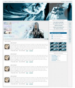
The Create version eight layout was probably the most well received Create layout outside of the original one. This layout borrows a lot from some previous layouts I had worked on, including the versions six and seven Create layouts which share a similar color profile and header setup, as well as the Synthetic Art layout which was the one that inspired those two previous Create layouts. Where the version eight layout differs was in it’s basic structure, there was a lot more going on. From the animated feature area, something I had toyed with on the version five and six layouts but finally got right here, to the more detailed navigation area. All in all this may have been the best layout Create ever sported, and it probably should have stuck around a little longer than it did. This layout was made in Photoshop 7, the banner was borrowed from my wallpaper Dream of Change, with some coloration to fit this theme more.
|
 |
Recollection
›› Posted On: 10.15.12 at 5:15 am ~ Tags: 2006, Abstract, Wallpapers
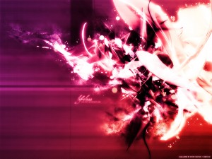
The story for Recollection goes something like this… One day I was looking through my wallpapers and realized that many times I liked to use the same form, as in many of my wallpapers share a similar placement of items. Upon noticing this I just on a whim opened up Adobe Photoshop and started messing around, taking fully completed wallpapers and layering them on top of one another with various layer effects to create some sort of merging. I ended up going through three versions of this before I came to what I felt was probably the best. From there I added a little more in the way of enhancing effects and some hue adjustments and ended up with this. This wallpaper is a re-collection of Lifeless + The Depths + Blood Splatters Pink. I have two earlier versions of this I will upload at a later date.
|
 |
Nebula of the Twin Giants
›› Posted On: 10.15.12 at 5:04 am ~ Tags: 2006, Artwork, Midsize, Space Scene
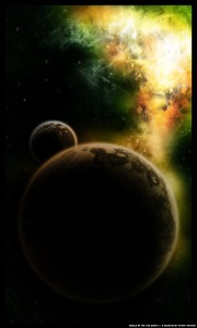
Previously I uploaded probably my most detailed space scene, Apocalyptica, this would be my second most. Nebula of the Twin Giants was the second of three large space scenes I did when I was experimenting with the genre, I feel it is better than the first but not as good as Apocalypica. In terms of the approach it was basically an attempt to make a better planet then what I had done in my first scene, which I feel like I achieved. For the planet (and the moon) I used some photos of gravel/broken up ground to give it a real beat up kind of surface that you would expect from some atmosphereless planets(moons). I was really happy with the outcome of the surfaces though they were nowhere near as detailed as Apocalyptica. The second approach was to continue working on my brushwork so as to make realistic a looking nebula/space dust/etc. I like how the coloring came out, and for the time I was very happy with my brushwork but looking at it now I was a bit heavy handed here, although the detail is there and I still find some aspects of the brushwork good. Nebula of the Twin Giants was created completely in Adobe Photoshop 7.
|
 |
Create Ver.9 Homepage
›› Posted On: 10.11.12 at 4:49 am ~ Tags: 2007, Create Layouts, Layouts
This layout is kinda a bridge between two different points of my designing era on groups. Before this I had spent quite awhile working in a very simply, yet detailed, style. This style was generally white or grey in nature. Through 8 previous layouts create had pretty much stuck to this style with very few deviations, especially the 3-4 layouts directly before this one. After this point however, I started to branch out more, and while this wasn’t really the defining layout that caused me to do so, it was one of them. To this day I’m still really happy with this one, I think it’s a pretty nice design, it’s well organized, it has nice pattern work and the fonts look nice. All in all I probably should have kept this one around a little longer before moving on to version ten and eleven, which were less well received.
|
The main hub for members of all projects hosted here on Dystopia Productions. Also home to all of the off topic discussion found on dyspro.
 New Layout Almost Done! New Layout Almost Done!
I've almost comepleted the work that...
›› ( Read Post ) ~ ( 24 comments )  What's going on here? What's going on here?
There have been a lot of changes on the...
›› ( Read Post ) ~ ( 9 comments )  Favorite Action Game Ever? Favorite Action Game Ever?
That's right, what is your favorite action...
›› ( Read Post ) ~ ( 77 comments ).
|
 New Layout Almost Done!

 Favorite Action Game Ever?