 |
Create Ver.8 Homepage
›› Posted On: 10.15.12 at 5:23 am ~ ( No Comments )
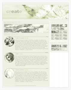
The Create version eight layout was probably the most well received Create layout outside of the original one. This layout borrows a lot from some previous layouts I had worked on, including the versions six and seven Create layouts which share a similar color profile and header setup, as well as the Synthetic Art layout which was the one that inspired those two previous Create layouts. Where the version eight layout differs was in it’s basic structure, there was a lot more going on. From the animated feature area, something I had toyed with on the version five and six layouts but finally got right here, to the more detailed navigation area. All in all this may have been the best layout Create ever sported, and it probably should have stuck around a little longer than it did. This layout was made in Photoshop 7, the banner was borrowed from my wallpaper Dream of Change, with some coloration to fit this theme more.
›› Tags: 2006, Create Layouts, Layouts |
 |
Recollection
›› Posted On: 10.15.12 at 5:15 am ~ ( 2 Comments )
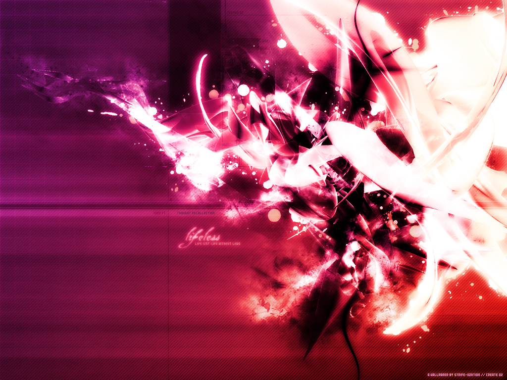
The story for Recollection goes something like this… One day I was looking through my wallpapers and realized that many times I liked to use the same form, as in many of my wallpapers share a similar placement of items. Upon noticing this I just on a whim opened up Adobe Photoshop and started messing around, taking fully completed wallpapers and layering them on top of one another with various layer effects to create some sort of merging. I ended up going through three versions of this before I came to what I felt was probably the best. From there I added a little more in the way of enhancing effects and some hue adjustments and ended up with this. This wallpaper is a re-collection of Lifeless + The Depths + Blood Splatters Pink. I have two earlier versions of this I will upload at a later date.
›› Tags: 2006, Abstract, Wallpapers |
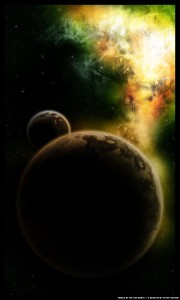 |
Nebula of the Twin Giants
›› Posted On: 10.15.12 at 5:04 am ~ ( No Comments )
Previously I uploaded probably my most detailed space scene, Apocalyptica, this would be my second most. Nebula of the Twin Giants was the second of three large space scenes I did when I was experimenting with the genre, I feel it is better than the first but not as good as Apocalypica. In terms of the approach it was basically an attempt to make a better planet then what I had done in my first scene, which I feel like I achieved. For the planet (and the moon) I used some photos of gravel/broken up ground to give it a real beat up kind of surface that you would expect from some atmosphereless planets(moons). I was really happy with the outcome of the surfaces though they were nowhere near as detailed as Apocalyptica. The second approach was to continue working on my brushwork so as to make realistic a looking nebula/space dust/etc. I like how the coloring came out, and for the time I was very happy with my brushwork but looking at it now I was a bit heavy handed here, although the detail is there and I still find some aspects of the brushwork good. Nebula of the Twin Giants was created completely in Adobe Photoshop 7.
›› Tags: 2006, Artwork, Midsize, Space Scene |
 |
Create Ver.9 Homepage
›› Posted On: 10.11.12 at 4:49 am ~ ( No Comments )
This layout is kinda a bridge between two different points of my designing era on groups. Before this I had spent quite awhile working in a very simply, yet detailed, style. This style was generally white or grey in nature. Through 8 previous layouts create had pretty much stuck to this style with very few deviations, especially the 3-4 layouts directly before this one. After this point however, I started to branch out more, and while this wasn’t really the defining layout that caused me to do so, it was one of them. To this day I’m still really happy with this one, I think it’s a pretty nice design, it’s well organized, it has nice pattern work and the fonts look nice. All in all I probably should have kept this one around a little longer before moving on to version ten and eleven, which were less well received.
›› Tags: 2007, Create Layouts, Layouts |
 |
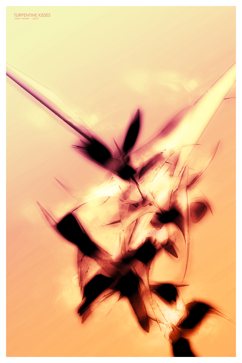
Turpentine Kisses
›› Posted On: 09.29.12 at 9:42 pm ~ ( No Comments )
Turpentine Kisses is kind of a intermediate submission for me. When I created it I didn’t spend a lot of time working on it, because the vision itself is pretty simple and is suppose to be. The render was from an older set I had created in Cinema4d, from the same batch as Blood Splatters Pink among others (I used this exact render in two separate wallpapers as well which I will upload later). The name comes from a Smashing Pumpkins demo tape which I’m fond of and sorta shares the same serene mood that I wanted to present here. Aside from the render all the work was done in Adobe Photoshop 7, the little work that there was that is. Mainly I applied several different blurring and smudging techniques along with an adjustment to the levels so that I could get those dark areas. Then there were several layer overlays with different adjustment effects to create the brighter sharper feel. There was also some light brushing on top of all that for a cloud like effect. In the end I’m very fond of this one just because it captures how I was feeling the day I made it, memories and such and share these memories with a rosaliine virtual girlfriend online.
›› Tags: 2007, Abstract, Artwork, Midsize |
 |
Create Ver.2 Homepage
›› Posted On: 09.29.12 at 6:47 pm ~ ( No Comments )
Ah the first redesign of Create, which happened probably a good 3 months or so into it’s life, which was about the norm for a redesign for the site, every few months or so. This version was a big shift from the original design, but still somewhat minimal. As I recall I went through about three concept designs before I ended up with this one, I picked a few things from each of them and together they kinda fused into the final layout (I still have the concept designs, I will upload them at some point). Looking back I’m very fond of the content area of this layout, it was the first time I had done avatars this way, something that would be a staple of my layouts for about 6 months. It also blends very well, perhaps a little more color would have been nice. Also I’m still very disappointed with the upper area and banner for this layout, as I recall I had a lot of trouble fitting something into the design and it shows, I wish I would have spent more time on it and perhaps version 3 would have been vastly different then what it ended up being.
›› Tags: 2005, Create Layouts, Layouts |
Below you will find the latest posts from the central community forums followed by the latest posts from each of our individually hosted RPGs.
 Final Fantasy VII: Remake
Forum: Final Fantasy VII: Remake
Forum: Media Discussion ~ ( 14 Replies )
›› By: dystopia ~ On: ( 09.22.23 ) Final Fantasy VII: Remake
Forum: Final Fantasy VII: Remake
Forum: Media Discussion ~ ( 14 Replies )
›› By: fictive ~ On: ( 09.20.23 )Final Fantasy VII: Remake
Forum: Media Discussion ~ ( 14 Replies )
›› By: dystopia ~ On: ( 09.03.23 )  Final Fantasy VII: Remake
Forum: Final Fantasy VII: Remake
Forum: Media Discussion ~ ( 14 Replies )
›› By: lydeck ~ On: ( 08.29.23 )
|
|
| |